The interface
The app has three zones: the side menu (sections), the top bar (preferences, notifications and your avatar) and the work area (lists, forms and details).
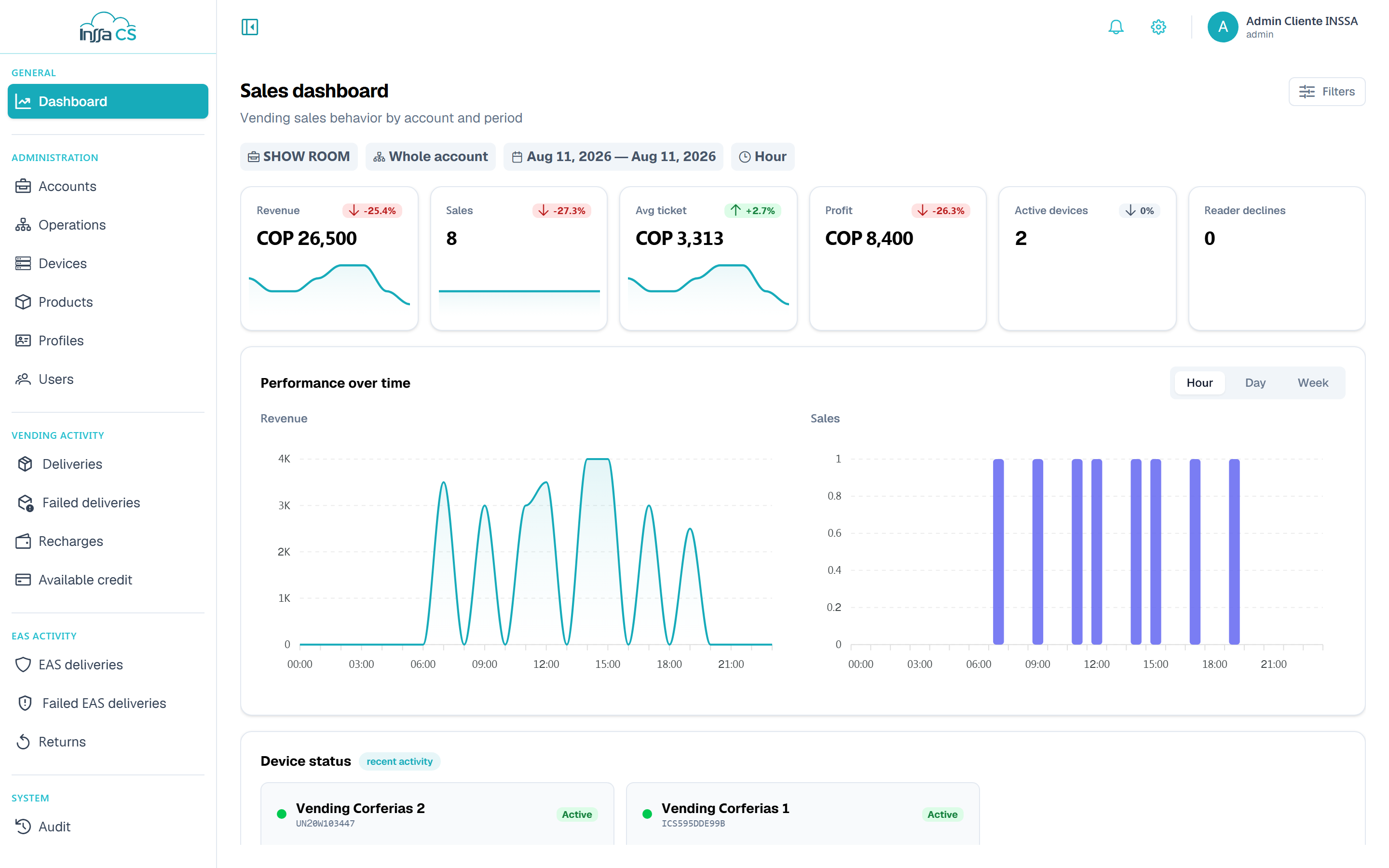
Side menu
Sections are grouped:
| Group | Sections |
|---|---|
| General | Dashboard |
| Administration | Accounts, Operations, Devices, Products, Profiles, Users |
| Vending movements | Deliveries, Failed deliveries, Top-ups, Available credit |
| EAS movements | EAS deliveries, Failed EAS deliveries, Returns |
| System | Audit |
Only the sections your role allows appear, and the Movements groups also depend on your business line: a vending operator does not see the EAS group, nor the other way round. Groups left with nothing visible disappear entirely, heading included. The button at the left of the top bar collapses the menu (icons only); on mobile it opens as a slide-in panel.
Operators, Roles and Developer (API keys) are not in the side menu: they live in your avatar menu.
Top bar
- 🔔 Bell: real-time notifications. See Notifications.
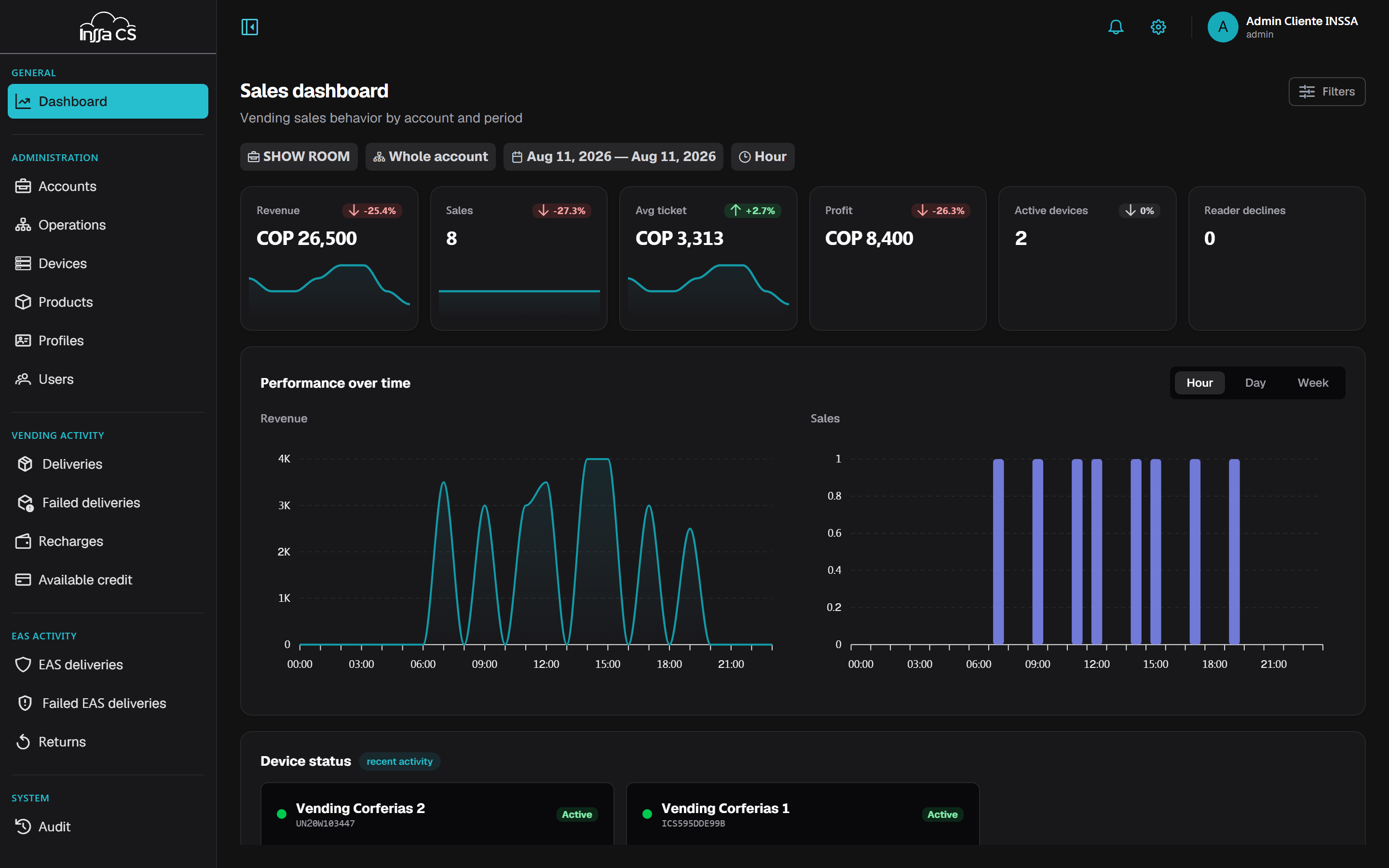
- ⚙ Gear: switches theme (light / dark / system) and language (Spanish / English) instantly. It is stored on your account, so it follows you to any machine.
- Avatar: My profile, Operators, Roles, Developer and Sign out (subject to permissions).
How lists work
Every list screen shares the same pattern:
- Search box over the relevant table fields.
- A Filters button (sliders icon) opening a side panel — right on desktop, bottom on mobile — with that screen's filters. Apply to run them, Clear to reset.
- Table with a single internal scrollbar: the header stays put and the page does not move.
- Reload refetches from the server.
- Where applicable, Export to Excel.
Lists load up to 1000 records per fetch. Movements screens also offer Load more for the next block.
Details: page or panel
- Accounts, Operations, Products, Profiles and Users open the detail in a side panel over the list: read, edit and close without losing your filters.
- Devices open a dedicated page with Detail and Inventory tabs.
In every case the detail opens with the eye button at the end of the row (or of the card, for devices): clicking the row opens nothing. Inside the panel, the pencil unlocks editing and Save changes applies it.
The devices list is not a table but a grid of cards, and on small screens every list switches to cards, with the same actions at the bottom.
Activate and deactivate look different per resource: a switch in a user record and on each of their codes, and buttons for accounts, operations, profiles and devices.
The full button list is in Icons and actions.
Destructive actions
Deactivating asks for a simple confirmation. Delete opens a dialog listing what gets removed in cascade and requires you to type the record's name to enable the button. Historical movements are never deleted.
Forms and errors
When the server rejects a form, the app shows an error block at the top with field-by-field detail (for example Name is required). Fix and save again. Session or permission problems appear as toast messages.